Inside your <head> tag, <meta> tags provide info on title and publisher and enable us to receive user input. There are six user-customizable controls: number sliders, hue sliders, boolean switches, color pickers, text fields, and combo boxes. Each control requires four core attributes, plus control-specific attributes.
| Core Attribute | Description | |
|---|---|---|
| property | Defines the variable name to be used in your code | |
| label | The text label shown to users for the control interface | |
| type | Specifies the data type: number, hue, boolean, or color | |
| default | Sets the initial value used by the control | |
| tooltip* | (*Optional) Displays a short description when the user hovers over the control |
Number Slider
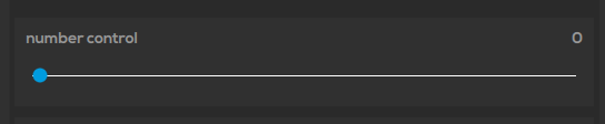
A number slider enables the user to pick a whole number within a specific range. It’s commonly used to adjust parameters such as how fast an animation runs, how many shapes appear on the screen, or how frequently an effect is triggered.
xxxxxxxxxx<meta property="myNum" label="Number Control" type="number" default="5" min="0" max="10">It looks like this in practice:
The number slider needs two extra attributes to work properly:
| Attribute | Description |
|---|---|
| min | Sets the lowest value the user can choose. |
| max | Sets the highest value the user can choose. |
Hue Slider
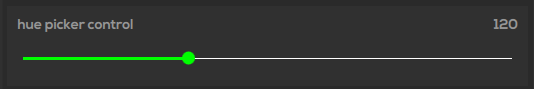
A hue slider lets the user select a color hue using the HSL (Hue, Saturation, Lightness) color model. It's typically used for basic color adjustments or choosing a base color for effects and elements.
xxxxxxxxxx<meta property="myHuePicker" label="Hue Picker Control" type="hue" default="120" min="0" max="360">Visually, it looks like this:
To function correctly, the hue slider requires two additional attributes:
| Attribute | Description |
|---|---|
| min | Defines the lowest hue value the user can select. The minimum possible value is 0 |
| max | Defines the highest hue value available. The maximum possible value is 360 |
Boolean
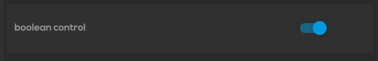
A boolean switch lets the user toggle between two states: "on" and "off". Its values are restricted to either 0 (off) or 1 (on). Unlike other controls, booleans rely solely on default attributes and don't require any additional configuration.
xxxxxxxxxx<meta property="myBool" label="Boolean Control" type="boolean" default="0"/>They are commonly used to enable or disable specific features, switch between modes (like vertical and horizontal), control visibility and behavior toggles in an interface, or trigger replay of effects.
Here's an example of how it shows up:
Color Picker
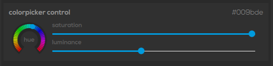
A color picker enables the user to select a color by adjusting its hue, saturation, and lightness components within the standard HSL color model. It is the most common and standard tool used for choosing colors, whether for backgrounds or on-screen elements.
xxxxxxxxxx<meta property="myColorpicker1" label="Colorpicker Control" type="color" default="#009bde" min="0" max="360"/>Visually, it looks like this:
The default value for the color picker must be specified in hexadecimal format. Additionally, it requires two extra attributes:
| Attribute | Description |
|---|---|
| min | The minimum selectable value, lowest possible value is 0. |
| max | The maximum selectable value, highest possible value is 360. |
Text Field
A text field, or text input box, allows the user to enter a string of characters. The input updates every time a character is added or removed from the field.
xxxxxxxxxx<meta property="myText" label="Text Field" type="textfield" default="yourText">This is what it looks like:

| Attribute | Description |
|---|---|
| default | can contain no characters |
List
A list lets the user select one option from a predefined list of values. For example, the user can switch between different character choices or effects to pick their preferred option.
xxxxxxxxxx<meta property="effectChoice" label="Effect Choice" type="list" values="Low Health,Option1,Option2,Option3" default="Low Health"/>It looks like this in practice:
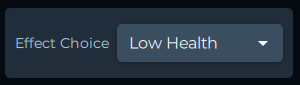
The values attribute defines all available choices, while the default attribute specifies which option is selected initially.
| Attribute | Description |
|---|---|
| values | A comma-separated list of possible string options |
| default | Sets the default selected option. If this value is not included in the values list, the combo box will show no default selection and may cause problems. |
For more info on gathering raw data from your application, check out our Smart Tags page!