User Controls in a plugin take the form of a global variable that can be modified by the end user. They're all exported from the plugin via ControllableParameters() which returns an array of setting objects as shown below.
export function ControllableParameters(){ return [ {"property":"LightingMode", "label":"Lighting Mode", "type":"combobox", "values":["Canvas","Forced"], "default":"Canvas"}, {"property":"forcedColor", "label":"Forced Color","min":"0","max":"360","type":"color","default":"#009bde"}, {"property":"SettingControl", "label":"Enable Setting Control","type":"boolean","default":"false"}, {"property":"dpi1", "label":"DPI","step":"50", "type":"number","min":"200", "max":"18000","default":"800"} ];}These setting objects always have a few base parameters. These are valid for all plugin User Controls.
| Parameter | Value | Type |
|---|---|---|
| property | The name of the variable you wish to assign to the control. | String |
| label | The label to display to the user. | String |
| type | The type of control. Currently, the following options are valid: boolean, number, hue, color, combobox, and textfield | String |
| default | The default value for the control. | Varies |
Number Slider
The number control allows the user to select the value of a number using a slider.
xxxxxxxxxx{"property":"dpi1", "label":"DPI","step":"50", "type":"number","min":"200", "max":"18000","default":"800"},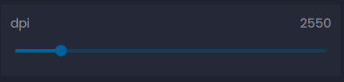
This control supports the following attributes:
| Parameter | Value | Type |
|---|---|---|
| property | The name of the variable you wish to assign to the control. | String |
| label | The label to display to the user. | String |
| type | "number" | String |
| default | The default value for the control. | String, Int |
| min | The minimum selectable value for the slider. This attribute supports negative values. | String, Int |
| max | The maximum selectable value for the slider. | String, Int |
| step | The step value the slider will increment and decrement by | String, Int |
Boolean Switch
The boolean control allows the user to select the value of a boolean variable using a toggle control.
xxxxxxxxxx{"property":"AngleSnap", "label":"Angle Snapping", "type":"boolean", "default":"0"},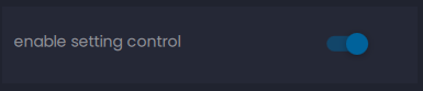
This control supports the following attributes:
| Parameter | Value | Type |
|---|---|---|
| property | The name of the variable you wish to assign to the control. | String |
| label | The label to display to the user. | String |
| type | "boolean" | String |
| default | The default value for the toggle. Set this to 1 to make "on" the default state. | String, Int |
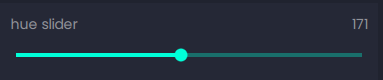
Hue Slider
The hue picker control allows the user to select the hue component of a color with a slider control
This control supports the following attributes:
| Parameter | Value | Type |
|---|---|---|
| property | The name of the variable you wish to assign to the control. | String |
| label | The label to display to the user. | String |
| type | "hue" | String, Int |
| default | The default value for the hue slider. | String |
| min | The minimum selectable hue value. This value must be between 0 and 359. | String, Int |
| max | The maximum selectable hue value. This value must be between 1 and 360. | String, Int |
Color Picker
The color control allows the user to select a color using a hue wheel, saturation slider, and luminance slider. The wrench icon will open a more advanced color palette for selection.
xxxxxxxxxx{"property":"forcedColor", "label":"Forced Color","min":"0","max":"360","type":"color","default":"#009bde"},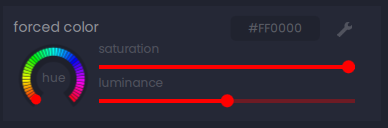
This control supports the following attributes:
| Parameter | Value | Type |
|---|---|---|
| property | The name of the variable you wish to assign to the control. | String |
| label | The label to display to the user. | String |
| type | "color" | String |
| default | The default value for the color picker. This must be specified as a hex value in the form #RRGGBB | String |
| min | The minimum selectable hue value. This value must be between 0 and 359. | Int |
| max | The maximum selectable hue value. This value must be between 1 and 360. | Int |
Combo Box
The combo box control allows the user to select from a dropdown menu of preset values.
{"property":"SleepModeTime", "label":"Sleep After x Minutes", "type":"combobox", "values":[5,10,15,30,60], "default":10},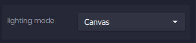
This control supports the following attributes:
| Parameter | Value | Type |
|---|---|---|
| property | The name of the variable you wish to assign to the control. | String |
| label | The label to display to the user. | String |
| type | "combobox" | String |
| default | The default value for the combo box. This value must be in the values array | String, Int |
| values | An array of values for the dropdown menu. Valid types are strings and integers. | [String, Int] |
Text Field
The text field control allows the user to freely enter text with an optional RegEx filter.
xxxxxxxxxx{"property":"textBox", "label":"Text Field", "type":"textfield", "default":"3"},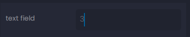
This control supports the following attributes:
| Parameter | Value | Type |
|---|---|---|
| property | The name of the variable you wish to assign to the control. | String |
| label | The label to display to the user. | String |
| type | "textfield" | String |
| default | The default value for the textfield. | String, Int |
| filter | an optional RegEx filter to limit user input | RegEx String |